Streamlit and PyGWalker: Create Data Visualization App with Ease
In this article, we'll dive into how you can use Streamlit with Pygwalker to analyze and visualize your data. It's going to be a fun and interactive journey, so let's get started!
What is Streamlit?
Streamlit is another popular Python library when it comes to building and sharing data apps. It allows you to turn your data scripts into web apps in a matter of minutes, rather than weeks. With Streamlit, you don't have to worry about complex web development or spending endless hours writing code. It's a fast, open-source, and completely free way to create interactive and shareable data applications using Python.
What is Pygwalker?
Pygwalker is a popular open-source Python library that makes data analysis and visualization a breeze. It takes your pandas dataframes (and even polar coordinate dataframes) and transforms them into an interactive visual analysis interface (like Tableau/superset/redash).
With Pygwalker, you can easily generate scatter plots, line plots, bar charts, and histograms with just a few simple drag-and-drop actions, without the need for coding skills. It's a powerful tool designed specifically for data scientists and analysts who want to explore and visualize their data quickly and effortlessly.
Additionally, you can also check out PyGWalker GitHub Page for more PyGWalker examples.
Getting Started to Use Streamlit with Pygwalker
Before we dive into the exciting world of Streamlit and Pygwalker, let's make sure your computer is set up with a Python environment (version 3.6 or higher). Once that's done, follow these simple steps:
Installing Dependencies
To get started, open your command prompt or terminal and run the following commands to install the necessary dependencies:
pip install pandas
pip install pygwalker
pip install streamlit
Embedding Pygwalker in a Streamlit Application
Now that we have all the dependencies in place, let's create a Streamlit application that incorporates Pygwalker. Create a new Python script called pygwalker_demo.py and copy the following code into it:
import pygwalker as pyg
import pandas as pd
import streamlit.components.v1 as components
import streamlit as st

# Adjust the width of the Streamlit page
st.set_page_config(
    page_title="Use Pygwalker In Streamlit",
    layout="wide"
)

# Add Title
st.title("Use Pygwalker In Streamlit")

# Import your data
df = pd.read_csv("https://sample.csv")

# Generate the HTML using Pygwalker
pyg_html = pyg.walk(df, return_html=True)

# Embed the HTML into the Streamlit app
components.html(pyg_html, height=1000, scrolling=True)
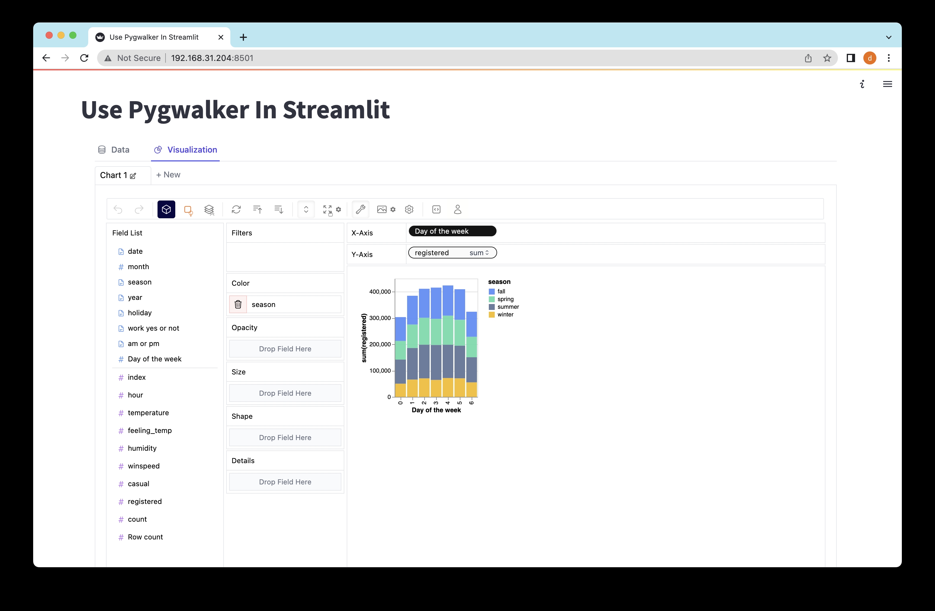
Exploring Data with Pygwalker in Streamlit
To launch the Streamlit application and start exploring your data, run the following command in your command prompt or terminal:
streamlit run pygwalker_demo.py
You should see some information displayed:
You can now view your Streamlit app in your browser.
Local URL: http://localhost:8501
Network URL: http://xxx.xxx.xxx.xxx:8501
Open the provided URL (http://localhost:8501) in your web browser, and voila! You can now interact with your data and visualize it using Pygwalker's intuitive drag-and-drop actions.
Saving Pygwalker Chart State
If you want to save the state of a Pygwalker chart, it's as easy as following these steps:
- Click the export button on the chart.
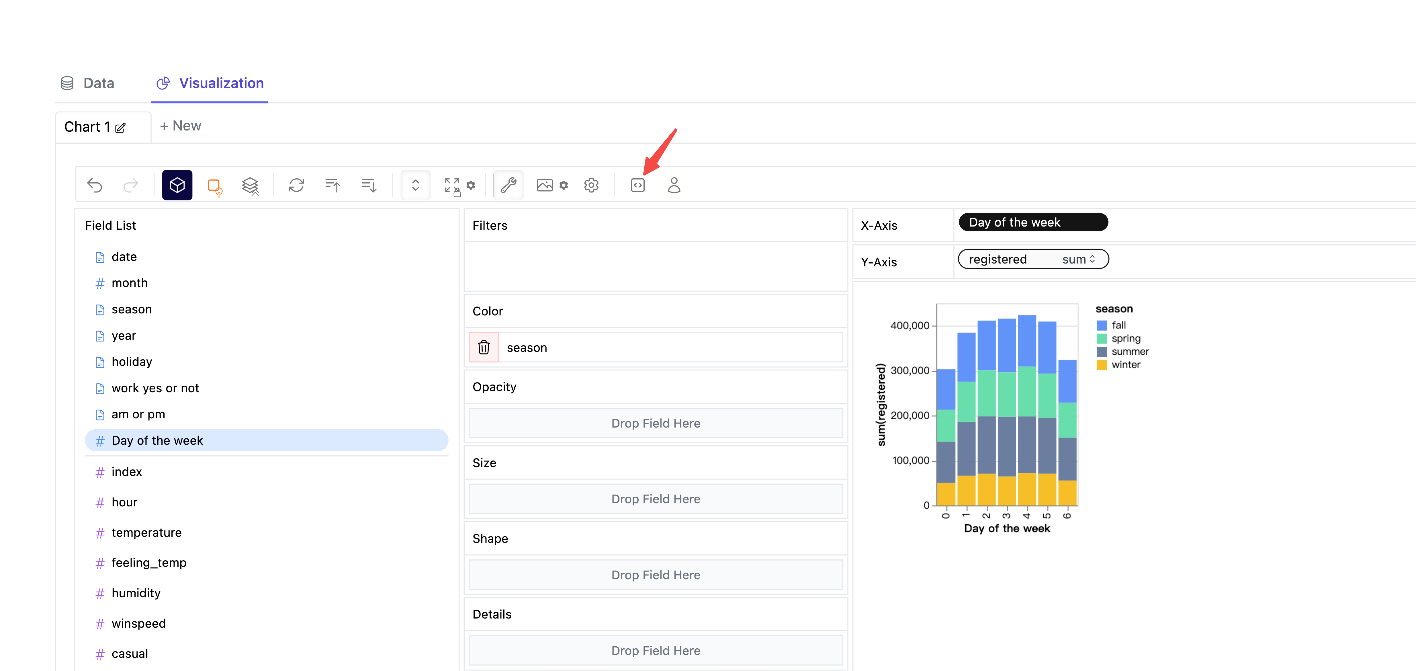
- Click the copy code button.
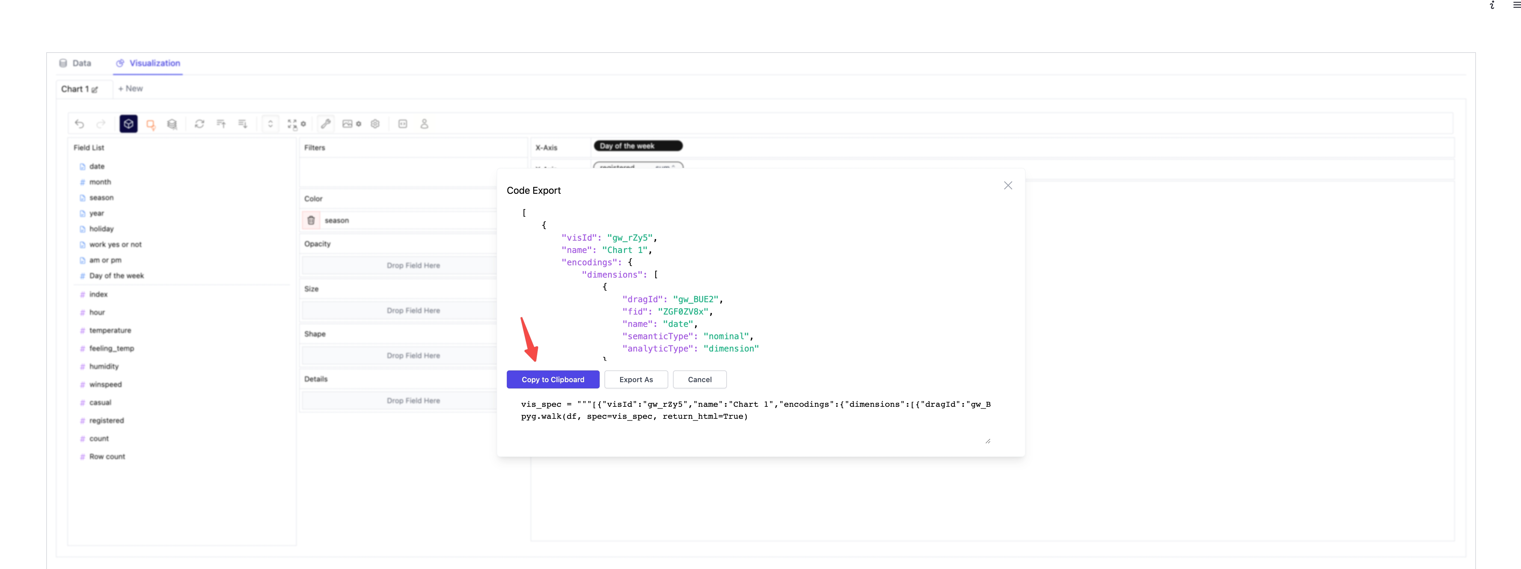
- Paste the copied code into your Python script, just where you need it.
import pygwalker as pyg
import pandas as pd
import streamlit.components.v1 as components
import streamlit as st

# Adjust the width of the Streamlit page
st.set_page_config(
    page_title="Use Pygwalker In Streamlit",
    layout="wide"
)

# Add Title
st.title("Use Pygwalker In Streamlit")

# Import your data
df = pd.read_csv("demo.csv")

# Paste the copied Pygwalker chart code here
vis_spec = """"""

# Generate the HTML using Pygwalker
pyg_html = pyg.walk(df, spec=vis_spec, return_html=True)

# Embed the HTML into the Streamlit app
components.html(pyg_html, height=1000, scrolling=True)
Don't forget to reload the web page to see the saved state of your Pygwalker chart.
Pygwalker is based on graphic-walker which can be embeded in anywhere like excel, airtable. So your pygwalker app can benefit from this feature as well and make collaborations with users in other platform contains graphic-walker/pygwalker.
Conclusion
Streamlit and Pygwalker are fantastic tools that make data exploration and sharing much easier.
With Streamlit's simplicity in building data apps and Pygwalker's intuitive interface and visualization options, you can enhance your data analysis workflow and effectively communicate your findings. So go ahead, dive into your data, and share your remarkable insights with the world!