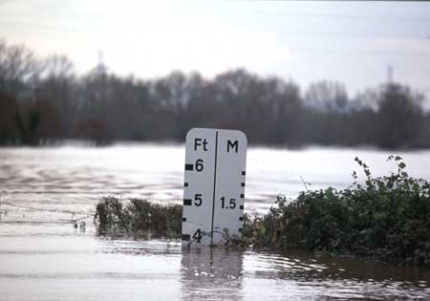
Flood measure
It's a great honour for me to be here speaking at the Greenpeace business lecture and it's also a wonderful opportunity for me to talk to you about the issue that, as Doug has just said, I consider to be the most serious issue facing us this century and beyond. What I'm going to do is run through the science behind climate change and then I'll run through what the British government is doing and what the international situation is and the sorts of things that we all ought to be doing on this issue. So just kicking off with the science.
The earth's energy budget is a key to understanding this process and I'm very keen to explain to people it wasn't discovered yesterday, this goes back to the great French mathematician Fourier who first understood the greenhouse effect and simply formulated it by saying the sun's energy comes in through the atmosphere, warms up the earth and the earth being warm then generates heat back into space and the atmosphere around the earth contains some of that heat which means that daytime night time temperatures are not that different as they would be, for example, on the moon where there is no atmosphere. That's the greenhouse effect and rather like going to bed with a duvet, if you're not warm enough you put another blanket on and you'll warm up. If you add to the greenhouse gases then something has to warm up and that something is, of course, the earth. So what we have here is a fairly complex picture. We've got solar energy coming in and you've got the energy penetrating the atmosphere is essentially the high energy part of the solar spectrum, the visible and ultraviolet light that gets through very effectively. Warms up the earth and the lower atmosphere and then we get what we call black body radiation, you get infrared radiation back out. So this is at the other end of the spectrum and what this means is that this can be absorbed, this energy coming back from the earth, by the atmosphere.
It was the British scientist Tindall who did the first measurements on how the atmosphere absorbs energy and discovered, much to everybody's amazement, that oxygen and nitrogen don't do any of the greenhouse gas effect. Most of the gas in the atmosphere doesn't do it and we now understand in detail why that is the case. But what Tindall went on to show was that carbon dioxide and water vapour are the key greenhouse gases in the atmosphere causing the Fourier greenhouse effect. If you therefore extrapolate forward in time and say supposing we're burning up too much in the way of fossil fuels and we generate more carbon dioxide in the atmosphere, what will that do to the global temperature? 1896, Arrenhius the great Swedish chemist who won the Nobel Prize, Arrenhius did the first calculation - real back of the envelope, pre-computer stuff - and he said what if we burn up so much fossil fuel that we double the carbon dioxide level in the atmosphere, what would the temperature of the earth do? And he concluded that it would rise by five degrees centigrade.
So today we have the world's biggest computer working on the problem, the earth simulator in Japan, I'm very proud of the fact that I set up the arrangement for our scientists to use that computer. And with the very best science going we're coming out with numbers that don't differ that much from what Arrenhius had said. And essentially the reason is because Arrenhius had encapsulated the problem rather well. What he hadn't understood was the complex feedback that as carbon dioxide levels go up, the sea level temperature goes up and so water vapour pressure increases and it's the water vapour that is causing much of the greenhouse effect. So it's primarily driven by the change in carbon dioxide, but then it's the change in water vapour pressure that is driving it. That's a complexity because water vapour forms clouds and clouds can reflect some of that yellow sunlight coming in on the left of my diagram and so reduce the greenhouse effect. And clouds can also keep in that red radiation coming back from the earth and cause warming. So it actually causes a complication and this is what much of the science is focused on understanding, the effects of cloud behaviour in the greenhouse effect. But all of the current models are pointing in the same direction.
Now, we can extrapolate back in time to learn a lot about the earth's climate system and the way we extrapolate back in time, the most impressive way, is to use ice cores. If you go to Greenland or if you go to the Antarctic, every winter you get a layer of snow formed and every summer a layer of dust, so you can count layers one by one, just as you can count tree rings on trees, and this means that if I take a deep ice core, take it to the laboratory, I can laboriously count up the years back.
Contained in the ice core is a memory of the atmosphere of the globe at the time that that snow fall fell and what is also contained is a memory of the temperature, of the oxygen 18/oxygen 16 ratios - it's a detail, don't worry about it. But that tells us it's a proxy for the temperature. So we have a record in those ice cores of temperature and carbon dioxide levels in the atmosphere.
Giving this lecture a year ago I would have said and we can go right back 350,000 years, but this year, quite recently, was published the latest data from the longest ice core yet taken, a thee kilometre long ice core, and the data has now been published and you can imagine how long this took to analyse, and I'm going to show you the results now. It goes back, and excuse the complication here, it goes back 800,000 years. So this is 800,000 years ago at the bottom and the present time at the top within the pink. And the right hand column here is data obtained from this ice core, which actually goes back 750,000 years. What is indicated here are the carbon dioxide levels in our atmosphere over that 750,000 year period. We see on the right hand side the warm periods in our past history and we also see the ice ages down here. And what we learn from this is that in all of the ice ages over that period, and you'll see you've got seven or eight cycles there, we had carbon dioxide levels at about 200 parts per million in the atmosphere. And in every warm period up here, you see the latest warm period, right where it says today, that little spike is our latest warm period, the carbon dioxide levels during the warm period 250-275 parts per million. That's the range for roughly 800,000 years back. What's interesting here is I'm comparing with some previous deep sea core data, in other words completely different set of data obtained from microfossils in the Atlantic Ocean sediment. And, again, taking cores from the sediment and you can get proxies for the same measurements just by analysing what's in the shells. And you'll see that the data set which was published previously gives remarkably good agreement on each of the ice ages and the warm periods. And so this is a wonderful piece of confirmation from two different bits of science pulling together in exactly the same direction.
All I want you to take from that is a memory of the two figures: 200 parts per million is the classic ice age carbon dioxide level, 270 parts per million the warm period carbon dioxide level.
Now, I'm going to show you the top bit of that curve again, so where we go into our current warm period. So now just a short time period snapshot, only 60,000 years back and so I've now expanded the scale. The left hand side is 60,000 years ago and this is carbon dioxide levels in the atmosphere and this is, again, the ice core data and it's coming to 20,000 years ago and then we see carbon dioxide levels going up and as they go up so we move into the current warm period. This is our current warm period and you will see that it corresponds to the period of our civilisation. You go back 12,000 years and you've covered the period of our civilisation.
Very important factor here is that as we move through this the full period of snowfalls in those areas where the ice has melted is now& the ice is entering the oceans and so sea level changes dramatically as we go from warm period to ice age to warm period. So the sea level as we go from the last ice age to the present warm period rises by about 110-15 metres, it's within that range. So the map of the world that we all know and love changed very dramatically over that period. Now, why is that important? Well, over the period of our civilisation we've been busy building cities like London at our coastlines. If we were anticipating big changes in sea level we would never have done that, that's the most vulnerable place to put your human population. But that's where our cities, most of our big cities are, around the world. Now, of course, when we look at the impacts of global warming we have to bear this in mind, that if we're going to go into a warmer period we've got to anticipate sea levels rising as more of the ice based on land masses is melted and goes into the sea. And I'll come back to that.
Now, there's our lovely warm period, the period of our civilisation. The green points are data points as well, that's just what's happened over the last 100 years. So that's the carbon dioxide levels going up since our population exploded from half a billion up to 6.2 billion today and we kept burning fossil fuels. So fossil fuel burning has generated that vertical climb in the carbon dioxide curve. Now, it looks vertical on this timescale plot where I'm plotting 60,000 years, but remember I'm saying this took place over about 100 years, post Industrial Revolution, that's the point at which we can begin to see carbon dioxide levels going up.
Now, I'm going to go to the data that has been in the news over the last few days. This is the beautiful data that Charles Keeling, the American scientist, has produced from Mona Lowa[?], the observatory in Hawaii. And what Keeling did back in 1958 is realise that it was pointless to try and measure the amount of carbon dioxide in the atmosphere if you were near any point of our civilisation because the generation of carbon dioxide on a daily basis changed so much. Go to Hawaii and one of these island observatories and everything is smeared out and averaged because you're a long way away from those disturbances and so you're just getting a nice global average. Keeling's data is now regarded as the most accurate data and even amongst the climate change sceptics, you won't find anyone who questions this particular data.
If you're wondering why the data goes up and down it's simply because the amount of carbon dioxide in the atmosphere changes between winter and summer and this is all the measurement that corresponds with the northern hemisphere. And the black line indicates the average carbon dioxide level over that period from 1958, and I've got this going up to 2005, which you can see at the top there. So the data is not published annually, it's published on a monthly basis and you can see each of the data points.
Now, I've marked on here because of the interest in the anomaly, the Keeling anomaly, the recent numbers. You'll see that around 1987 2.55 was the jump in the carbon dioxide level from the previous year, whereas over here we've got an anomalously low jump of .67. Now, the slope of the curve from 1993 to 2005 generates around 1.85 parts per million increase per annum. So over this period, and this of course is the most important information from this curve, since 1958 the amount of carbon dioxide in the atmosphere has risen from 310 parts per million, and the normal warm period value is 270, to the current value of 378 parts per million. So what we've seen is a very substantial rise in the amount of carbon dioxide in our atmosphere and largely attributable to the use of fossil fuels, partially attributable to vegetation losses, to deforestation in particular.
So that is the essence of the problem. The so-called Keeling anomaly, if I could just make a brief comment. The question is whether those two data points, 2.08 and 2.54 are significantly above that average figure of 1.85 I've just given you. Hang on. Wait for another five or ten years and then we'll see whether that is significant, but let's not forget there's always a higher level of carbon dioxide, marginally higher, when there's and El Nino southern oscillation. And in that period, 2002/2003, there was an El Nino. The biggest drought that India has suffered was in 2003 because of that El Nino. So I personally think we're looking at extreme events which have corresponded to the El Nino event. But nevertheless I want to stress this increase is taking us up into what has to be described as relatively dangerous levels of carbon dioxide for our planet.
Now, why is that going to be the case? First of all, because we correlate following what I described to you as the greenhouse effect, these changes in carbon dioxide with changes in global temperature. From weather stations around the world we know that the global temperature has now risen on average by .6 - .7 degrees Centigrade over the last century. And this is something that is visible to anyone who climbs mountains in the tropics in particular. If you have a favourite glacier you will know that that glacier's boundary is moving up the mountainside at quite a rate. The famous example is Mount Kilimanjaro which has lost 85% of its so-called permanent ice cap, that's an ice cap that dates back to the previous ice ages. Now, it only has 10-15 years left before Kilimanjaro loses all its ice.
This here is the Greenland ice sheet, also withdrawing and it's moving back at a rate which is variously estimated at around one metre a year, from a NASA study in 2001. The latest study indicates that it's moving back at about ten metres per annum. So there is an acceleration apparently of the rate of moveback of the boundary of the Greenland ice sheet. I can make a general statement that if you take glaciers around the globe, then you will find that the glaciers are retreating and this to me is a very important measure of what is happening because these glaciers, many of them have been dated back to the last ice age. So this isn't something that has been happening, did happen before a thousand years ago. This is something that is new, that is generated by our relatively high carbon dioxide levels. So when people say is this an anthropogenic effect, I would say this looks like an anthropogenic effect because we have understanding of the greenhouse effect, we see the carbon dioxide levels rising, we have the prediction from Arenius and others and now we see the retreat of the glaciers and this fits in with our measurements of temperature rise.
Actually the most recent data is a very comprehensive study of glaciers in China and this is a 24 year long study using a mass of data, they've concluded that there's a 5.5 shrinkage by volume of the Chinese glaciers over that 24 year period. Why is that significant? 15% of the world's ice on land is in those Chinese glaciers. If that melts it's heading towards the oceans and that leads to sea level rises.
Now, what's happening to that Greenland ice sheet and how can we estimate what is going to happen to it? If the Greenland ice sheet were to melt, the sea level would rise by between six and seven metres, and obviously that's a little problem for us in London, it's a problem for people in New York and so on. Massive problem for the whole country of Bangladesh and there is a big issue. How long would that take? There are two issues here; first of all, is there an irreversible point where the carbon dioxide level goes up to the point where the melting of the Greenland ice sheet begins and then won't stop? And the latest scientific analysis indicates yes, there is. Once you start the Greenland ice sheet melting because of the inertia in the system, these are very slow response systems, the reason is the heat capacity is so enormous, the response is very slow. Once it's started it keeps going for hundreds and even thousands of years. Carbon dioxide in the atmosphere will stay up there for a long time as well.
So what is the point at which the Greenland ice sheet will start melting? The latest indication is when the temperature around the Greenland land mass area is 2.7 degrees Centigrade above the pre-industrial level. We're already .6 degrees Centigrade above that level. What level of carbon dioxide therefore do we need to avoid going beyond in order to avoid testing this theory of melting of the Greenland ice sheet - something we'd all like to do, I think. I used to say 550 parts per million, I'm now thinking that that might be pushing it a bit. So we are talking about perhaps 500 parts per million as the level beyond which we shouldn't go to try and test this model. How long will it take to melt the Greenland ice sheet? I wish I'd stressed this every time I spoke with the media because that six to seven metre rise is not going to happen tomorrow or the day after tomorrow. This is the latest data from a computer analysis conducted at our own Met Office, and by the way, they Met Office and the Hadley Centre there are regarded around the world as the world leaders in the modelling of climate change effects. And what you see is that if we take at 0 time 100% of the ice present, we're down to 61%, so we've lost roughly 40% of it in 600 years. So it's a fairly slow event this, and by the time you've gone out to 3,000 years there's still a little bit of ice left, something like 3% of it is left. But don't forget that by this time, 61% left, sea levels have risen by three metres and you're already changing the coastlines of our major land masses.
So this is the best calculation that's been done so far and in their model what they've done is increase carbon dioxide levels above pre-industrial level by fourfold, so as to precipitate that irreversible step of the beginning of the melting of the Greenland ice sheet.
Now, the Hadley Centre have also been modelling back into history climate change events to test their models. So we have enough information, as I've shown you, of the previous history of the world. This is just a very recent bit of previous history, going back to when the first meteorological stations were set up, 300 of them around the world, to get average temperatures of the globe. And the data are in red here from those averages and the model set up by the Hadley Centre, the model, if you like, predictions from that starting point are shown in grey. You'll see that the model encapsulates what actually happened exceptionally well. And I want to stress we're including here in the modelling both anthropogenic effects, manmade effects, the burning of fossil fuels by us, and we're also including natural effects such as volcanic effects. So everything is included here. When you leave out the anthropogenic effects, you do not get the agreement between grey, theory, and red, the experiment that you see here. And that's yet again an indication of the connection between carbon dioxide levels and the level of global warming.
Now, all of that looks as if we've got the science done and this may be the only point at which I take issue with what Doug said I said. It's not all done because there are a number of complicated issues, we call these non linear feedback phenomena, that still have to be properly factored into the calculations. It's really very difficult to cope with these in a quantitative way in these models. The point at which deep sea methane clathrates begin to start bubbling up to the surface of the sea would be problematic because the methane is another greenhouse gas. So we're adding to the problem. That's called a positive feedback and so we accelerate the global warming if that beings to be triggered. I think many of you know, if you haven't go and see the movie, The Day After Tomorrow, about the weakening of the Atlantic overturning circulation, this great global heat conveyor that keeps our temperature about eight to ten degrees centigrade higher than it would otherwise be. Any chance of that being weakened or turned off? It is already weakening a bit, the chances of it turning off, we think, are pretty low. We're putting below 1 in 100. I'll come back to it if I'm asked questions, but let's leave that. Equatorial forest switching is a possibility.
Can I just draw attention to what happens with the equatorial forests? The current predictions indicate that we will see the forests of the Amazon area become drier as we move through the coming climate change period, and when they dry they may well begin to die and, of course, the forest will then become net carbon dioxide emitters and once again we have a feedback effect. These are effects that we really want to avoid. Of course, as we lose ice cover, we change what we call the albido[?], which is simply the reflectivity of the earth, that sunlight is very efficiently reflected back by white snow and very inefficiently reflected back by land mass. So that's another positive feedback effect; as we lose ice that becomes less relevant.
Now, why should we worry about this? Well, we're getting some indication of impact already and here's a warning; we have to be very careful about saying that extreme events are due to global warming. We've always had extreme events and so the event in Boscastle I think would be rather difficult to attribute to global warming. These events have happened over the years. The UK floods in autumn 2000, that may have something to do with global warming and I'm going to say a little bit more about the European heat wave in 2003. 30,000 deaths during that heat wave and roughly 3� billion damage direct costs to the built environment.
So looking at these extreme events we have a difficult issue because we've always had extreme events. So how do we analyse them? This is the analysis produced recently in Nature of that extreme summer in central Europe compared with every previous summer for 150 years. So there's a blue line for the average summer temperature in that area of Europe for every summer back 150 years, and there's the red line. You can immediately see by any account this was an extreme event. Now, mathematically we can see that it's about five standard deviations away from that goucien[?], that makes it a highly improbably event, like a one in 4,000 year event. Or there is some trend within this data which is not indicated by putting it all into one graph and we can follow that trend with this plot here. So this is the annual average temperature in the European area in black over this period from 1900 to 2000. And you'll see that that summer 2003 is clearly an extreme event even on the smooth curve running through the black line. It's an extreme event. But if we had no global warning we'd have been on the green curve here and you can see that an extreme event like that would possibly have taken us up to about the red line, so that the extreme event would have brought us to what is currently an average summer. So we can really indicate from this that that extreme summer roughly half of it can be attributable to the fact that we're on this upward moving curve which is the global warming effect. So we are seeing extreme events which are attributable to global warming, at least in part, and these are having quite devastating effects.
I'll just show this curve because it shows in a little more detail what happens. We saw there, that was four degrees centigrade above the average summer for that part of Europe, but if we look at that in detail you'll se that in some parts of France that was eight to ten degrees centigrade about the average. It's because of that extremity in some regions that France experienced such massive problems.
Now, the other issue of course is that alongside on this planet is a whole biodiverse world and we know that we're losing that extent of biodiversity from the living planet index, and I just indicate here from the WWF website where we're going. The curve indicates that we're down from 1975 we've lost something like 30% of our species. Now, I've listed here all of the basic reasons that are generally given and the last one is climate change on my list. As we go ahead through the next 50 years, I believe that climate change will rise on that list in terms of causes of loss of biodiversity.
We show this to be a little bit controversial. What we see here arises from the fact that we know that we're over fishing cod in the Atlantic and what the curve shows in red is the data from that area in volume of cod dating back to 1958. And you'll see that we lost a fair bit of cod over this period 1982-1991 as volume in the Atlantic. And of course if you believe that's due to over fishing, we should stop fishing and let the stock rise again. Or is that right? The cod larvae feed on plankton, so what we're showing here in this paper published in Nature by Bogran[?] is also the population of plankton in the same area of the sea over the same period of time. Now, if the cod overpopulates the area the plankton population goes down and this leads to a classic oscillation in predator/prey populations. And it seems to follow that oscillation with something like a one year time lag, which is what you would expect.
Now, if you're over fishing the cod plankton levels should go up because they're not being eaten by cod larvae. It looks as if we're losing plankton and that's the reason for at least a part of the drop in the cod population here. Why are we losing plankton? The plankton here are called Arctic plankton and if we warm the seas the degree north that the plankton survive moves upwards so the plankton are essentially moving northwards, so we could lose cod population for an additional reason to over fishing. We need to keep a very close look on all of these factors as we move ahead.
What do we have to do? First of all, the planet system has a lot of inertia, not just the societies on the planet, I'm fully aware of the inertia there, but also the inertia in the climate system. And within that system therefore we know that because of the current levels of carbon dioxide in the atmosphere, the climate change effects are with us for the next 30 or 40 years whatever we do. Even if we stopped emitting now, we've effectively committed ourselves to a further period of global warming. It's the longer term effects that we will have a positive effect on by reducing our emissions. That means that we really have to adapt to the changes that lie ahead for us over the coming period, but at the same time we ought to mitigate against further damages in the longer term, for the sake of our grandchildren, so that we reduce the longer term problems.
Now, because of this I set up a Foresight Programme back in 2002 and we took on board about 92 scientists and we worked for about 18 months on the problem of flood and coastal defence management for the UK in the light of what we understand about global warming and increased risks from that. And so we extrapolated forward over what most people would say is a funny period of time, about 80-100 years, but it's not too long for consideration. If you build a power station its lifetime is about 40 years. So you build a coal fired power station today and you want to get value for money, you'll run it for 40 years. Is that a good move? You need to know what's going to happen over quite a long period ahead. We have full sponsorship by DEFRA and DEFRA have responded to our report and indicated that they will take action.
Let me just give you a snapshot, literally, of one part of the analysis. This is the most detailed analysis that's been done of any country of the increased flood risks arising from global warming. Now, I know when I show this that people tend to look at where their particular house is, it's a ten by ten kilometre pixel scale and you just have to pick this up. When I was in the House of Commons people were really quite concerned about whether their constituency was appearing black. So these are the problematic areas under the worst case scenario, and there's the best case scenario. In either of these two scenarios it's going to get quite a bit worse and we can see here, this would be if we did nothing to improve flood management, I have to quickly say, we can see here where action is required, that's the beauty of this analysis. And we have now put in a whole series of suggestions to DEFRA and they're busy working on this and we'll come up with plans over the next five, ten years to meet up with it.
We have a very good example of Foresight in action some years ago and here I refer back to the floods in 1926 in London that made people think about trying to control the River Thames and just to point out the barrier was finally first used in 1982. That's the social inertia I was referring to. It does take time to set up a project of this kind. A stunningly beautiful piece of architecture, I think, but also stunningly useful. It was constructed with the intention that it should be used about once every five years. And now I'm going to show you what the usage would have been if it had been in place and it would have prevented a number of floods. So this is going back to when it would have been used usefully to prevent floods before it was first used in 1982. And this is the current usage. You'll see that instead of using it once every three to five years, we're now using it on average six times a year and the usage anyone can see is climbing upwards. It was a damned good thing we put it up. Any one of those floods breaking through the barrier today, it's estimated would cause a direct cost to London of about �30 billion. But it would also knock out the City of London because our rail underground system would be flooded and many of the power stations. So good thing we've built it, but given the frequency of the floods, a particularly good thing it's turned out to be a good lesson for what to do in preventing increased risk as we move ahead.
Now, there are other things we need to do. If we look at transport, something like 25% of our carbon dioxide comes from transport and if we look at the way we developed our transport over the period back to 1980 - 2002, what I've got here is in this nice Cambridge blue, is car, van and taxi. And then moving up, we've got in purple, bus and coach. Then in yellow, rail. Then we've got motor cycle, bicycle and finally air. Now, there's a lot of attention paid to air, but I just want to point out actually the majority of us want to drive our own cars and this is really the modern civilisation behaviour, we all want to get in cars. Is this a good or a bad thing? Well, before we all criticise the loss of the rail system, we make rail more attractive, don't we, by making trains run much faster. As the trains run faster, let's take 200 kilometres per hour which is now being accessed, what is the carbon dioxide per passenger mile? It's heading up to aircraft levels and way above car levels. So because we're improving the combustion engine and the miles per gallon on cars, actually cars are now beating rail in terms of carbon dioxide generation. There's always a surprise when you start looking at the data.
So no very simple answers here, we need to look at transport as a whole and take this problem on board. Now, of course, one area of transport is aviation and I'm now taking that same set of data and just blowing up that little bit on the top of that last pile which is the aviation level. And, of course, yes, people want to fly off on holiday and it's been made very cheap because we don't have a mechanism for applying tax to aviation fuel. That really is the short answer to this. We want to get there quickly, but how quickly when EasyJet do many trips in one day, it's very efficient, we're on and off in no time at all, it seems as if they're running down the runway before they've shut the door, they haven't refuelled. So what they're doing is fuelling once in the morning, taking off with full loads which get more and more empty as the day proceeds and, of course, that's the way to use up a lot of fuel and make a lot of carbon dioxide go into the atmosphere. So we've got behavioural problems which we can only look at in terms of the regulatory system. But that's complicated because we're onto an international issue, and we are talking about international issues.
What's the problem with planes? Not only carbon dioxide emissions, but also the vapour trails, the contrails. The contrails here look rather nice, but these contrails generate into cirrus cloud and we actually know from post-9/11 when all jets were grounded for a few weeks, that the daytime/night time temperature difference changed by one degree centigrade, which is exactly what the global warming calculations indicate because the contrails disappeared, the cirrus disappeared, and that was keeping the United States warmer at night. So there are real effects from planes. The big difference between this and carbon dioxide, I quickly add, is that two days after stopping flights over the United States the contrails had disappeared. So water vapour disappears, carbon dioxide will hang around for centuries. Carbon dioxide is the main driver of change.
Globally we have various levels of action. First of all, Kyoto, and I have to say, yes, I had a bit of an interesting visit to Moscow, but the outcome of whatever that discussion was seems to be rather good, at least at the moment. It's rather pleasing to see that President Putin has&
[t1 s2]
In Europe we're already beginning emissions trading in January 2005, I hope it all goes smoothly, I believe it will. And so that process of attaching a value to not emitting carbon dioxide is the kind of regulatory behaviour we need internationally to see that action begins. Kyoto is not enough, Kyoto is a beginning and it's a good process. And what will be needed is once we've got the process up and running, it will need to be ratcheted up so that we can really bring emissions under control. The key problem, of course, is going to be moving into the second period, when we need to bring on board (not only Australia and the United States) but also the big growing economies, China and India.
Back home we're working on every front. Improving energy efficiency, increasing use of renewables, low CO2 emitting energy sources. Working as well to ensure security of supply, these two things go hand in hand. Diversifying energy supply also makes it more secure. And finally adaptation strategies. The UK government is committed to reducing carbon dioxide emissions by 60% by around 2050, the Prime Minister has announced that during his period in the Presidency of GA, he is leading on just two issues: climate change and Africa. And we have already committed ourselves to action to meet that White Paper.
Let me move on from that curve, it's a bit complicated. This is GDP growth of in blue the USA, in red the UK - interesting that we're not that far behind - over the period 1950 to the present time. And it also shows carbon dioxide emissions from the two countries. The point of this curve is to show you can decouple GDP growth from carbon dioxide emissions. In fact, from 1990-2002 our economy grew by about 34% and our basket of greenhouse gases dropped by about 14%. You can decouple growth from emissions and that I think is a critical point as we move forward.
We have developed models of the fuel mix as we move forward. This is the fuel mix as we go forward to 2050 without any carbon constraints and there is, of course, a large patch of purple here corresponding to gas turbines creating an enormous dependence on imported gas over that period of time, but also, of course, creating carbon dioxide emissions over that period of time. We can do that if we extrapolate forward again to 2050 meeting the 60% obligation, so this all work that went into the White Paper development. And now we're looking at various forms of energy coming onstream which are renewable, and this is just an indicator of the extent of renewables of each form that would be required to meet our growing energy demands, but to reduce carbon dioxide emissions. This was no nuclear, no sequestration, the alternative model shows in pale blue here what would happen with nuclear and with sequestration. So the two models have been put forward and, of course, what we need to do as we move forward is see how the two curves develop, whether we're going to need nuclear new-build or not will depend on how these curves generate themselves in the next few years.
Let me just mention low emission vehicles because I'm very pleased to say that today Mike O'Brien, the Minister for Energy, announced a new award to young scientists to travel to the San Diel[?] laboratories in America, which is a world leading laboratory in hydrogen fuel technology, so that we can work with the US to develop our own capability in that area.
I must just mention the built environment. This consumer 50% of our energy. We need to move very, very strongly towards improvements in building design so that energy usage is dramatically improved. You'll see that this is a direct win/win. The costs of running these buildings are reduced and the emissions are reduced. And this an area where we're pushing as quickly as we can. Lighting, 20% of electricity consumption in lighting. So if we could just move to cheap light sources such as LED lights. In Denver they're switching to the LEDs partly developed in the UK, and you'll see they're saving a lot of money, but they're also saving a lot of carbon dioxide emissions by simply switching traffic lights and nothing else in the city of Denver.
Combined heat and power, just want to say here's the benchmark for us all, Denmark, 50% combined heat and power electricity available in Denmark. We've got a lot of headroom there, UK at 5.5%. So there's a lot of room to make up, a lot of improvements. We can reduce energy demand very substantially. But in the long run we are going to need major energy sources and a major part of my activity has been in working towards the generation of fusion power stations. I believe that we could have fusion power stations generating large scale electricity in 35 years or so.
I'm sure I've overstayed my welcome. Let me just finish by saying we have a global problem that will require a global solution. Action on climate change is the UK government's priority and finally action is affordable, inaction is certainly not.
Thank you.
[applause]